Wikipedia:Featured picture candidates/Stork
Appearance

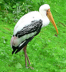
Another one of my vacation pictures. I think this one came out really well. →Raul654 06:55, Jan 24, 2005 (UTC)
- Nominate and support. - →Raul654 06:55, Jan 24, 2005 (UTC)
- I know it's probably hard to avoid, but the white feathers are washed out and I can't see any of their detail. Oppose. Enochlau 12:13, 24 Jan 2005 (UTC)
- Oppose. Very average photography. ed g2s • talk 12:15, 24 Jan 2005 (UTC)
- Oppose. I agree with Enochlau. There are lot's of blown-out hightlights and lack of feather detail. Plus the colors look very oversaturated. Alight 21:32, 24 Jan 2005 (UTC)
- Oppose. As above. --Fir0002 11:02, 25 Jan 2005 (UTC)
- Support. It's true that you can't see the white feathers, but it looks good overall to me. - RedWordSmith 05:51, Jan 29, 2005 (UTC)
- Oppose. green is definitely oversaturated. -Lommer | talk 06:02, 1 Feb 2005 (UTC)
- Not promoted +2/-5/0 BrokenSegue 21:06, 9 Feb 2005 (UTC)
